At Hertility, the mission was clear: revolutionise reproductive healthcare by putting women front and centre.
The goal was to take reproductive science out of the lab and place it directly into the hands of women everywhere. Hertility aimed to set a new standard for female health education, empowering women to take control of their bodies and life choices. This was more than a product—the beginning of the “Mother of all movements,” where women are fully supported in their health journeys.
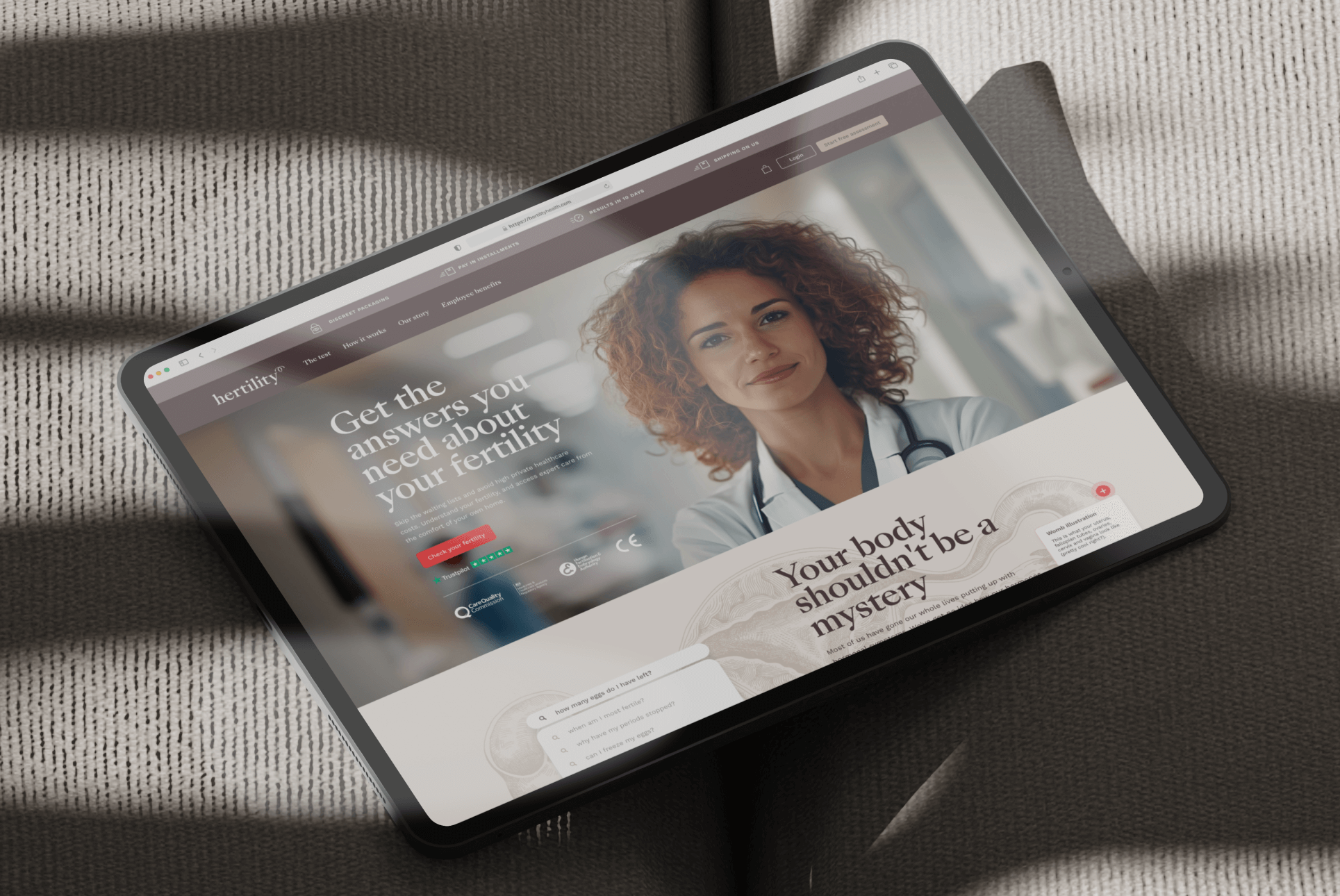
Designing for the health industry comes with its own set of complexities. The challenge wasn’t just about aesthetics; it was about ensuring transparency, creating a brand that was inclusive and accessible, and avoiding the cold, clinical feel of traditional healthcare visuals.
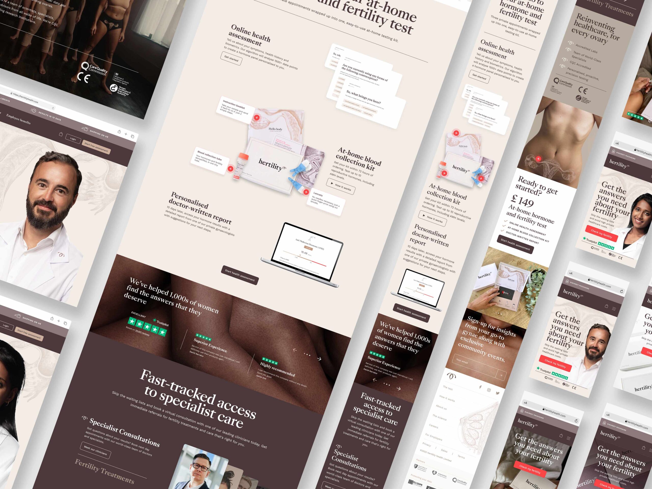
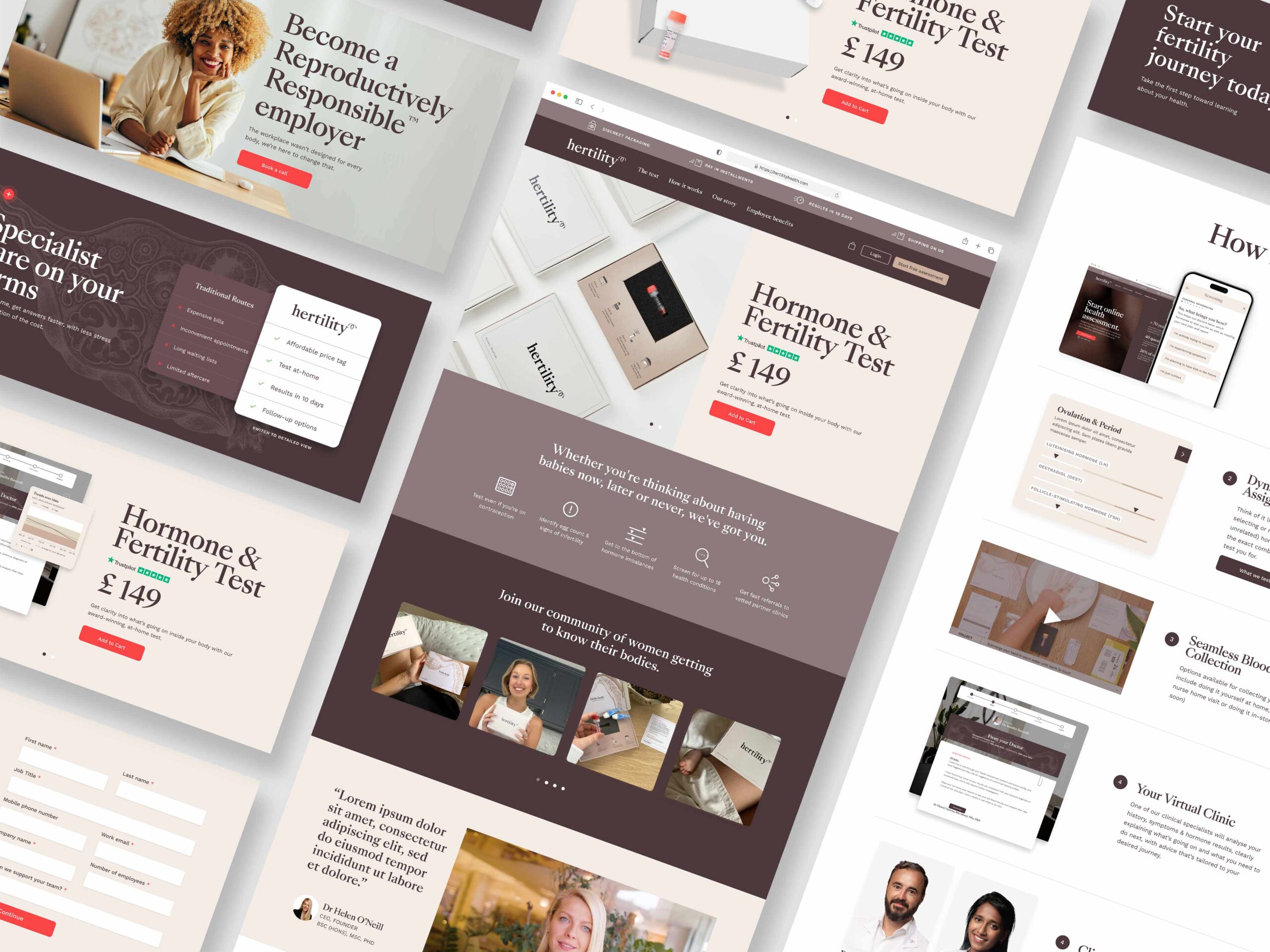
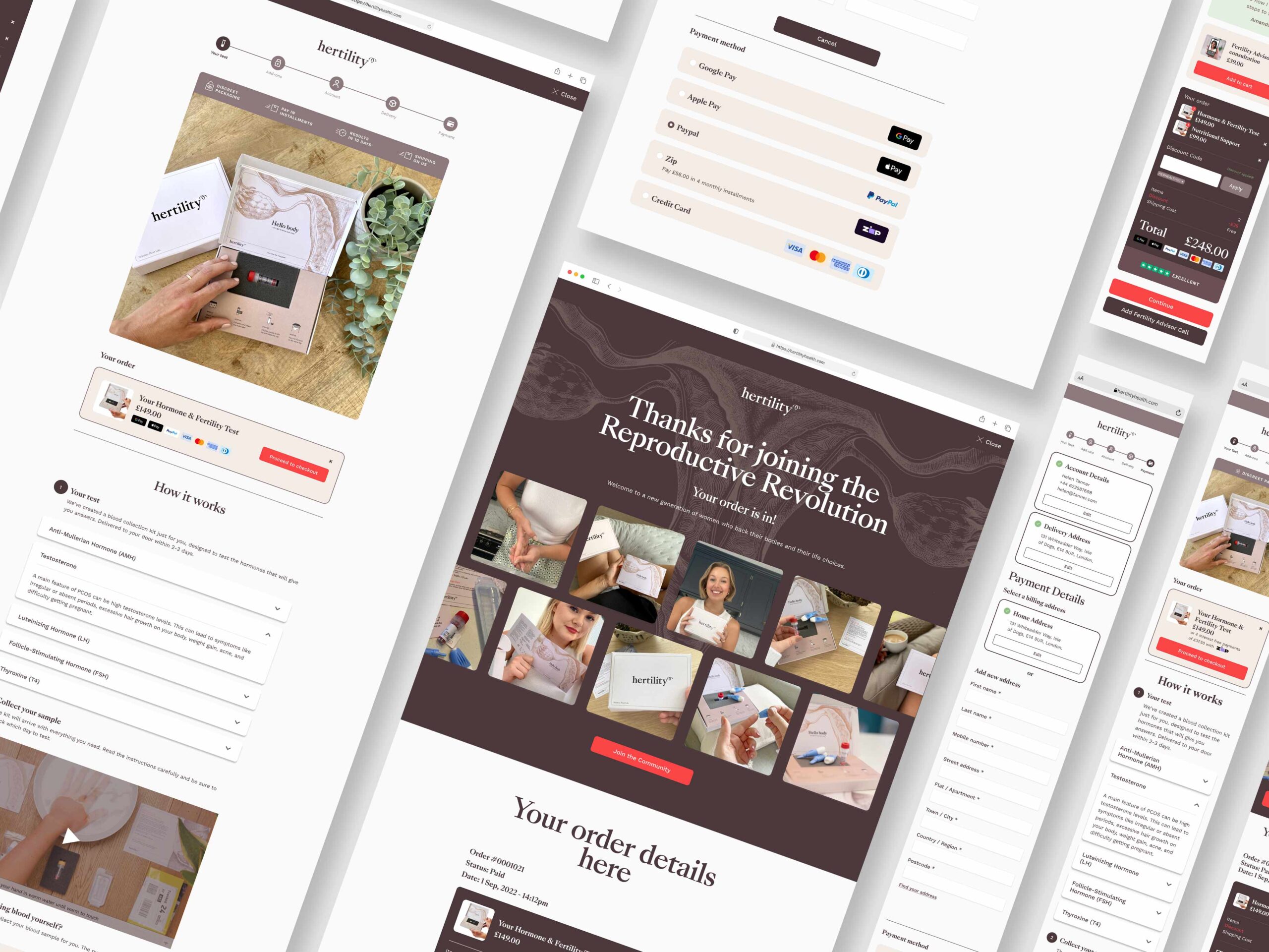
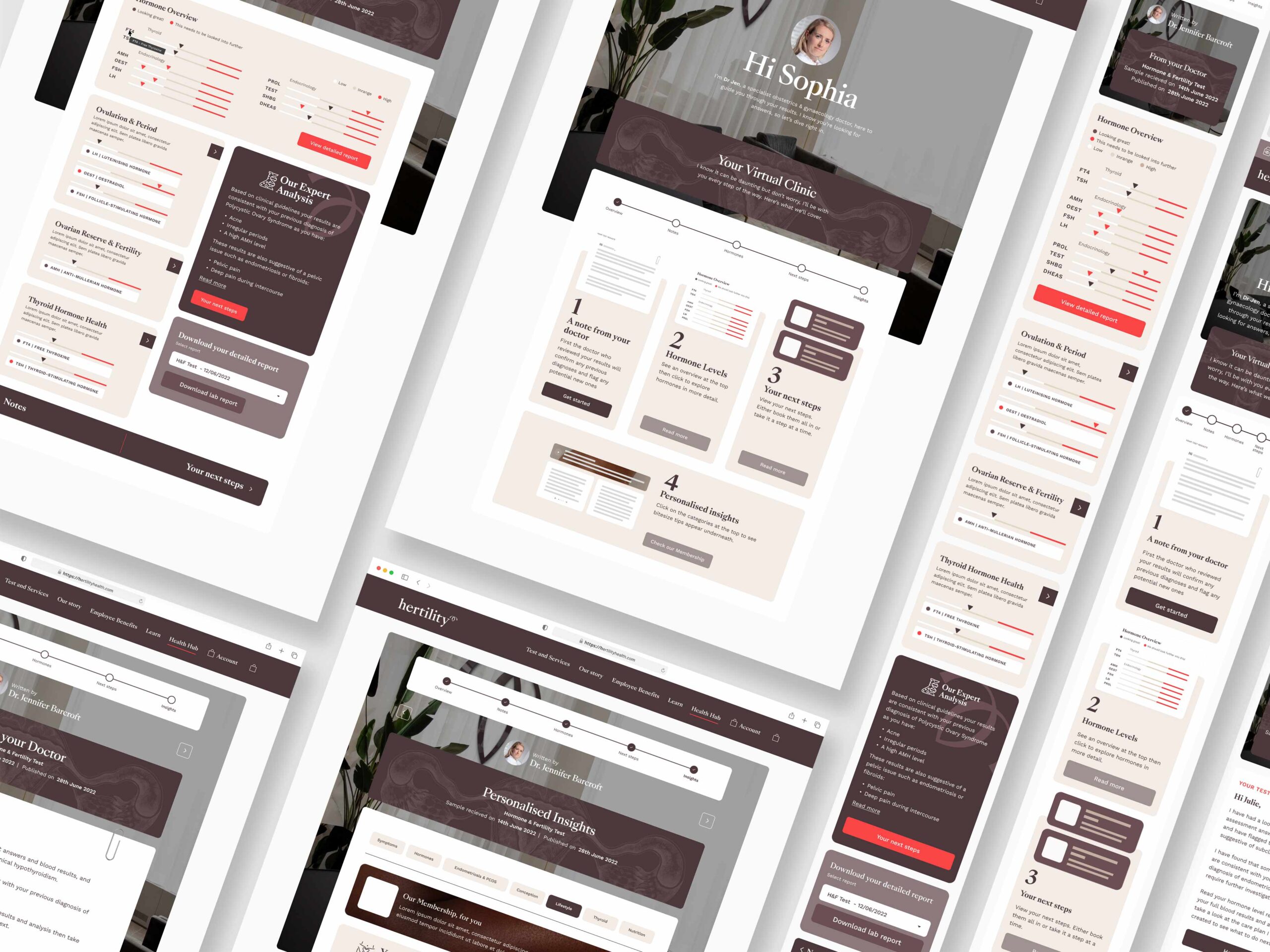
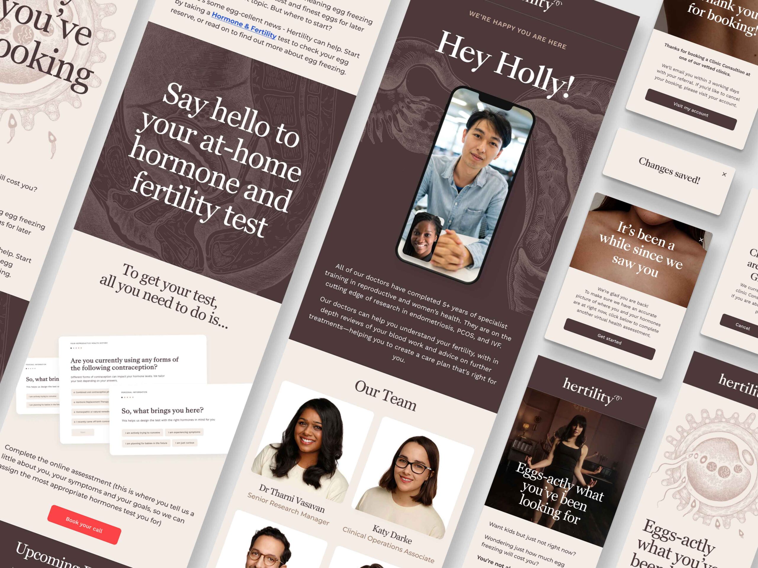
When I joined Hertility, they were in the middle of rebranding but needed the WOW factor in their visuals. My mission was to bring that uniqueness and finish the rebranding process, making sure that the brand felt real, approachable, and relatable to our users. We wanted to go beyond typical health images, showcasing body diversity and imperfections and using illustrations to educate and make users feel at home.
Some of the challenges we faced included:

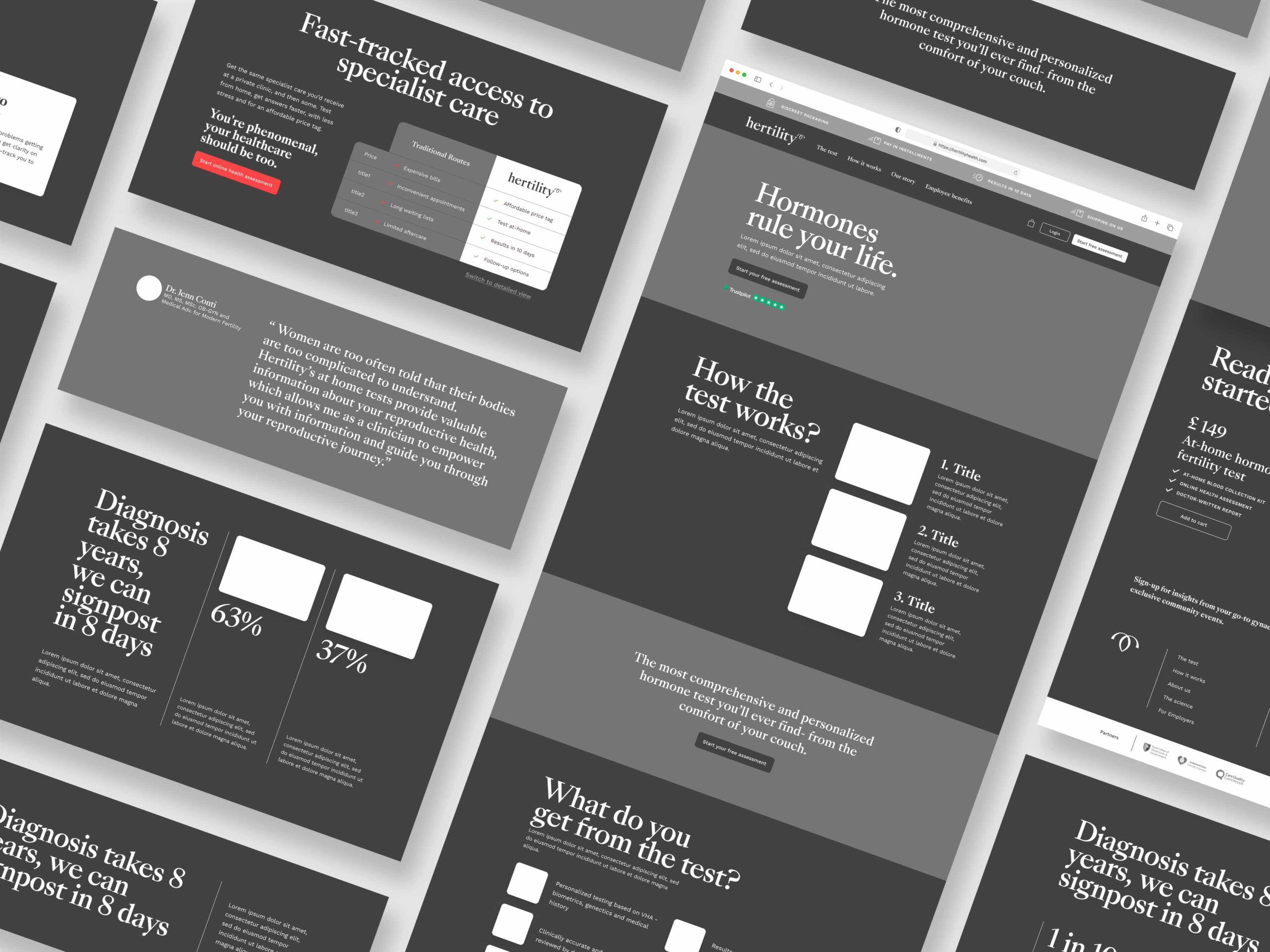
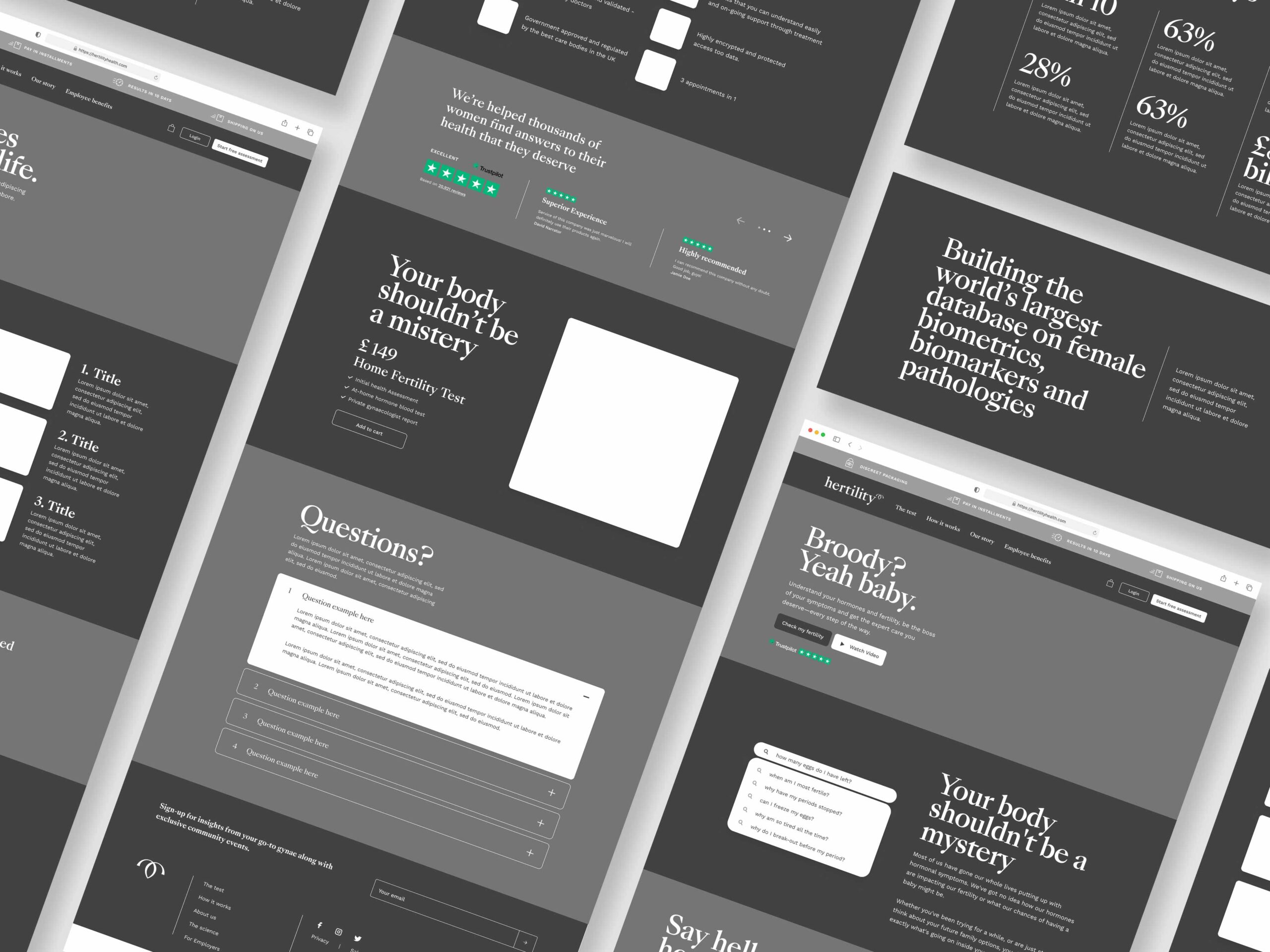
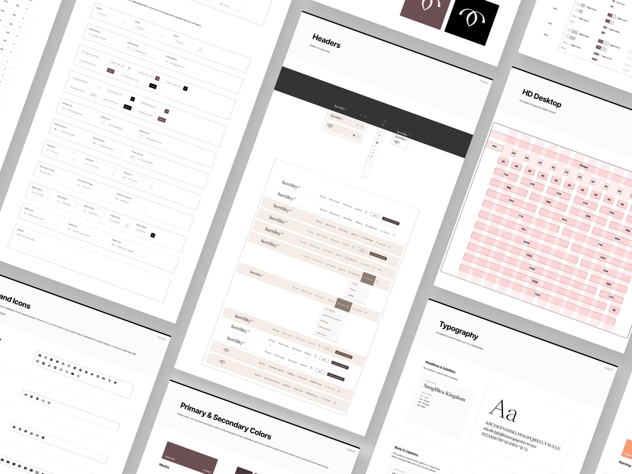
To tackle these challenges, I immersed myself in the world of reproductive health by interviewing 80% of Hertility’s specialists and founders. This allowed me to fully understand the industry’s complexities and our users’ needs before diving into the product design. After this learning phase, we approached the project as follows:


me@pequelord.com
100% Remote
Let’s chat about your brand, review your portfolio or a mentoring session…