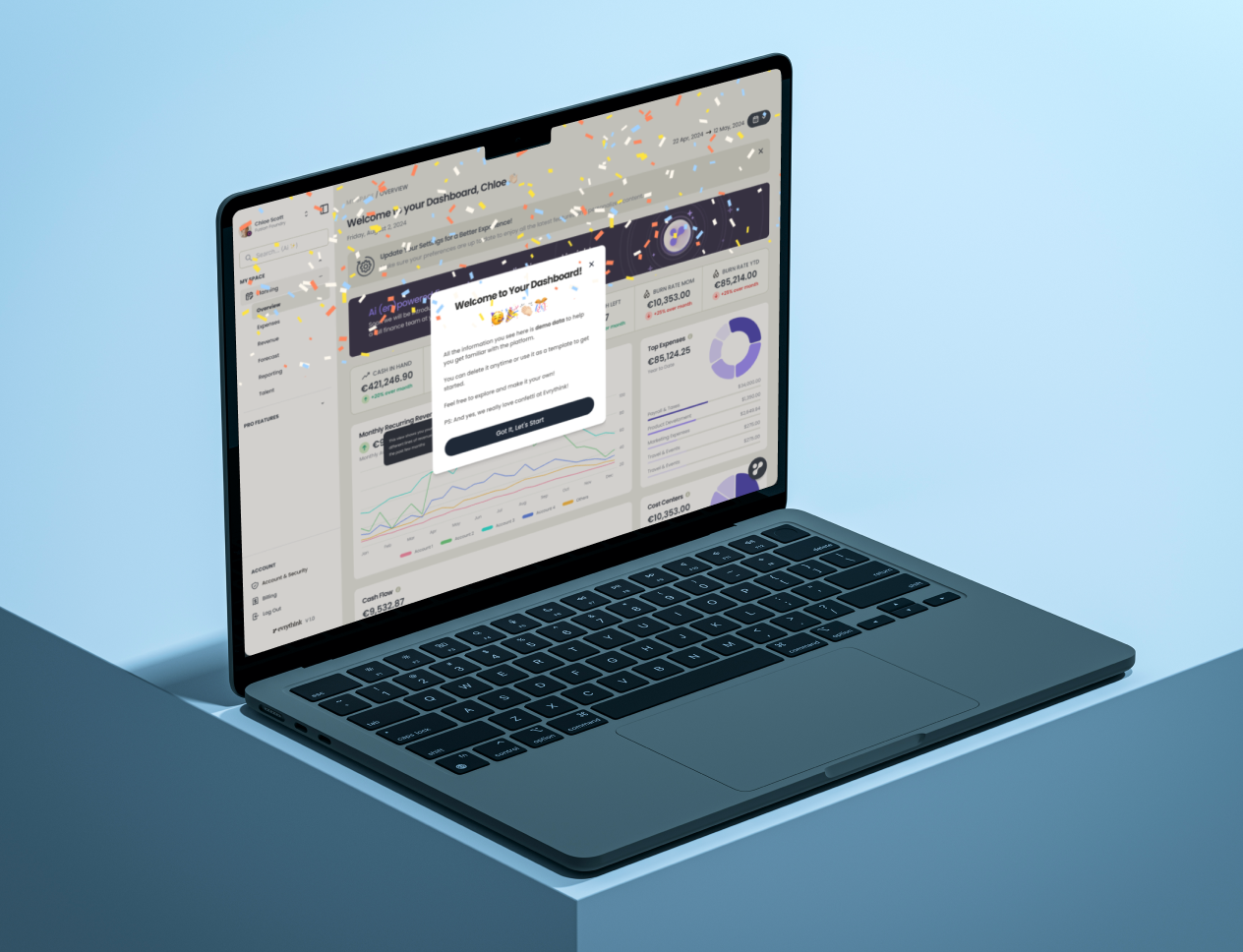
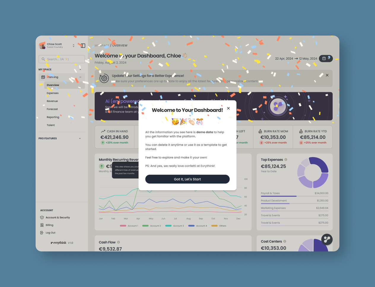
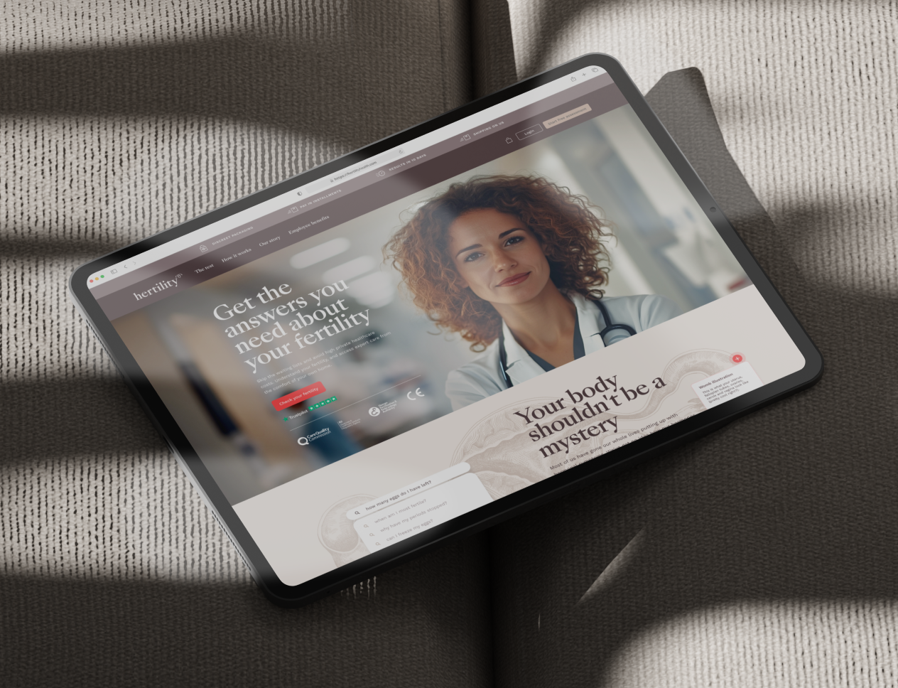
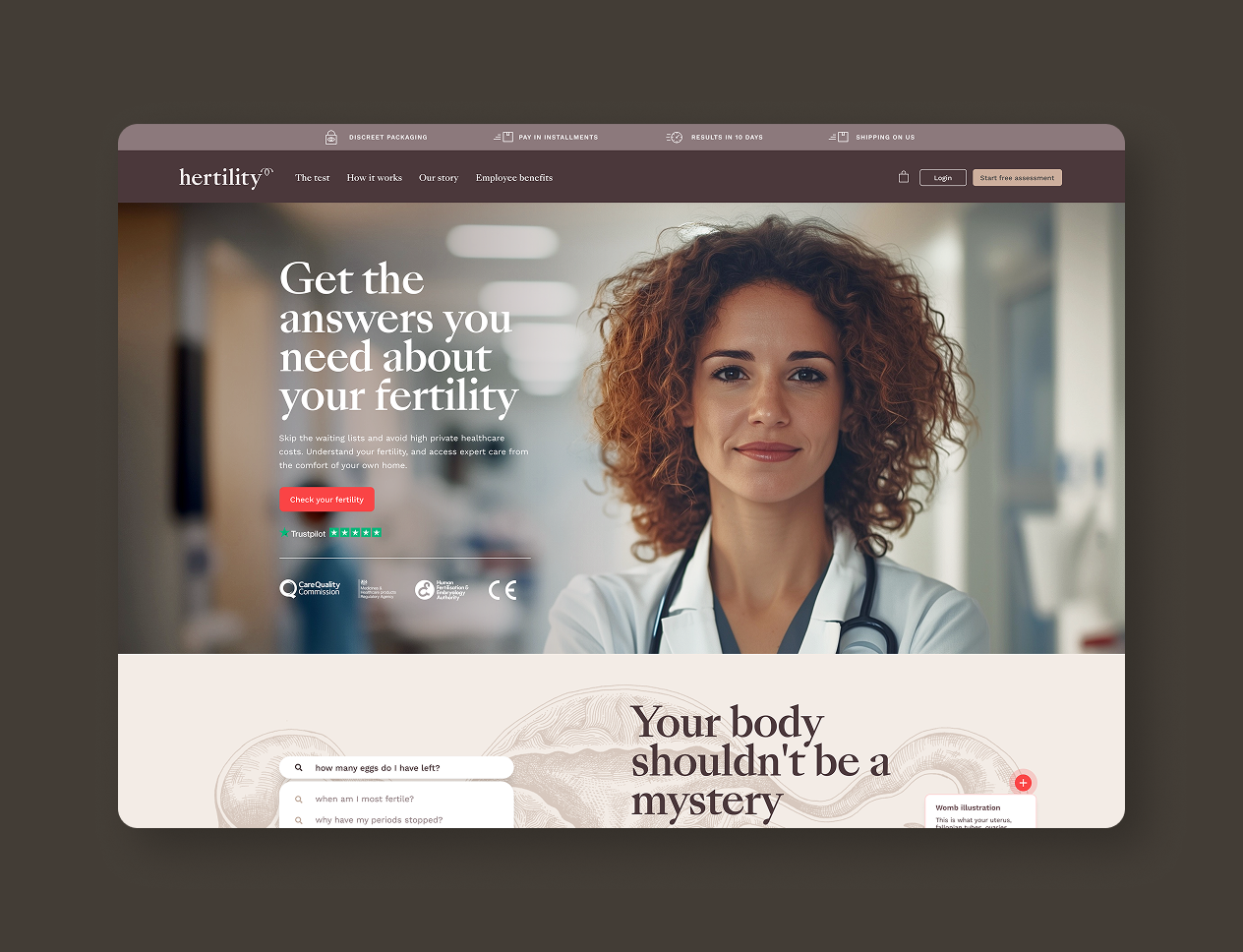
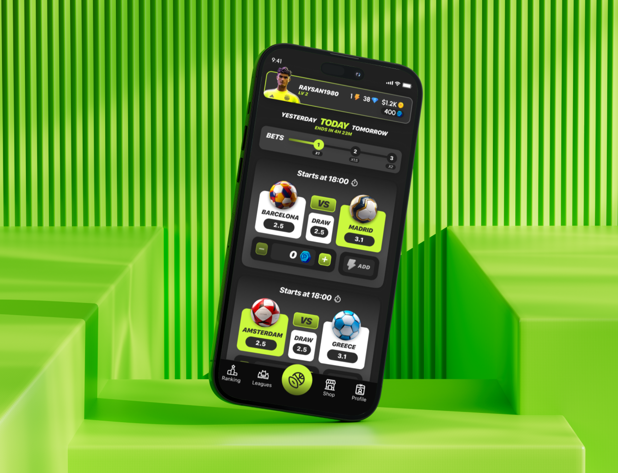
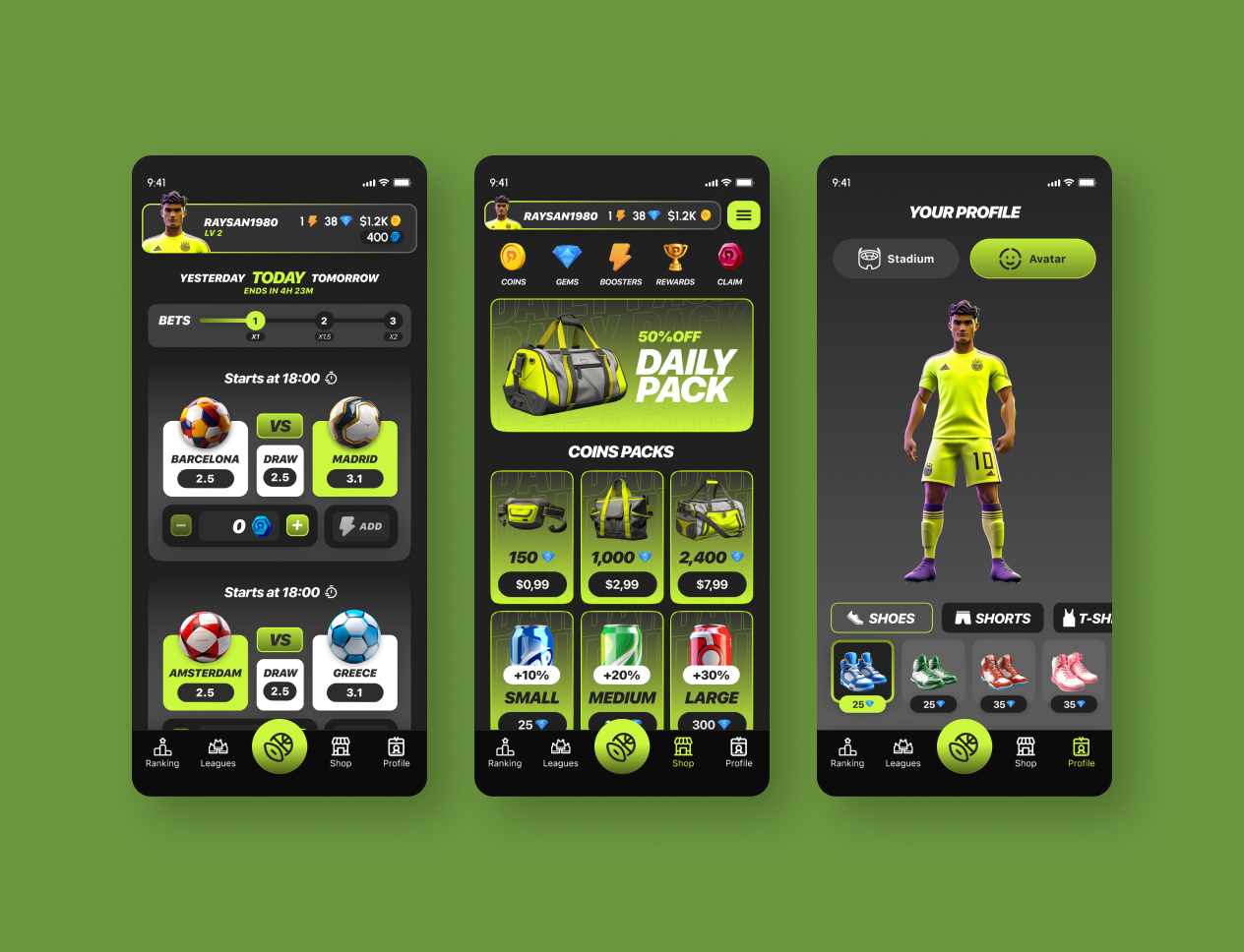
Evrythink: Startup Finances, Made Easy.
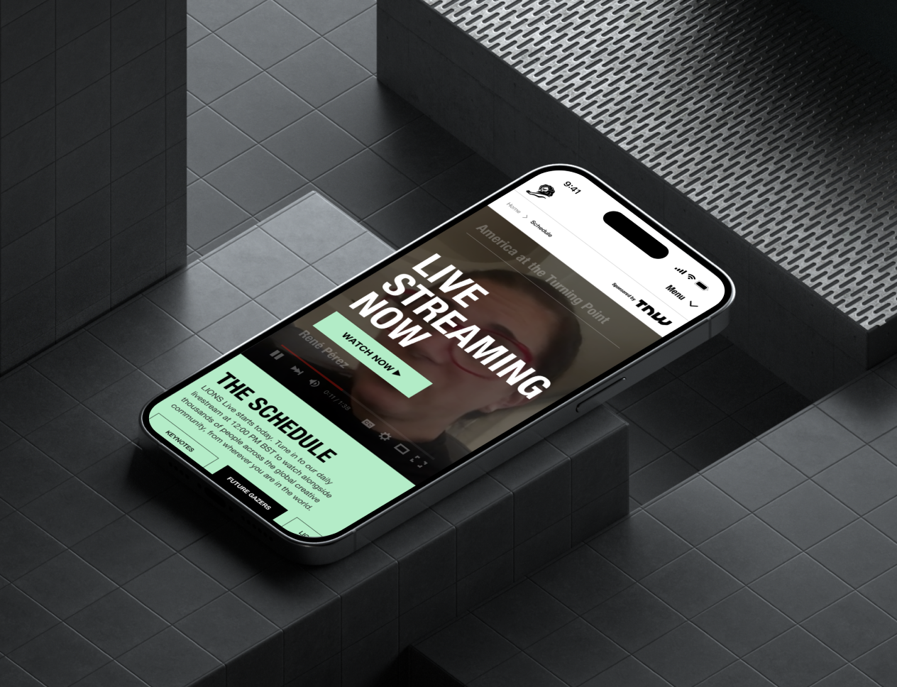
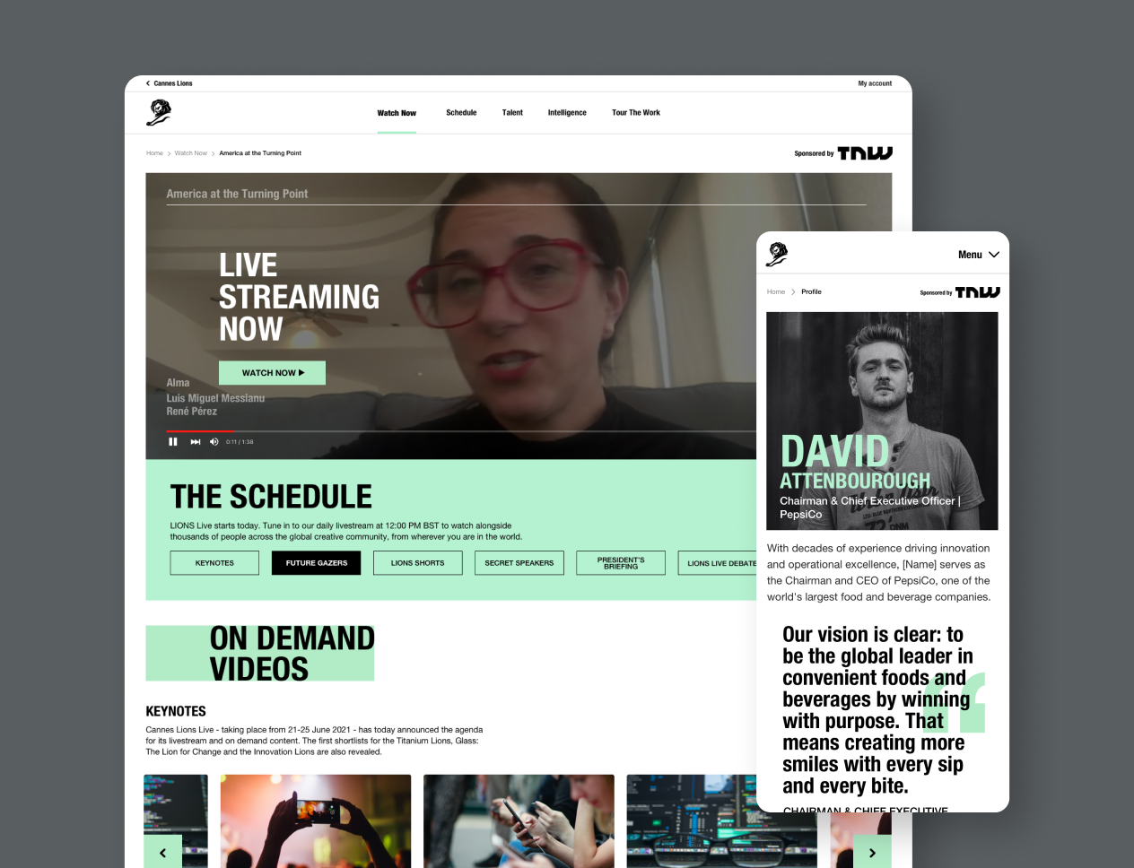
WEB3, UX/UI, BRANDING, AI, RESEARCH, TESTING
AI SYSTEMS PRODUCT ARCHITECT
I'm Ray, Product Designer, CPO, and AI Systems Product Architect, helping teams shape digital products, AI workflows, and user-centred experiences.
WEB3, UX/UI, BRANDING, AI, RESEARCH, TESTING
UX/UI, BRANDING, RESEARCH, TESTING
UX/UI, BRANDING, RESEARCH, TESTING
UX/UI, BRANDING, RESEARCH, testing
ux/ui, branding, research, testing
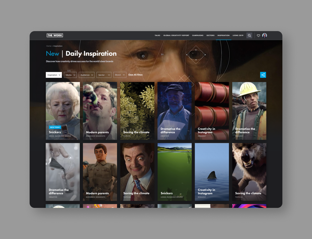
WEB3, UX/UI, BRANDING, RESEARCH, Illustration, app


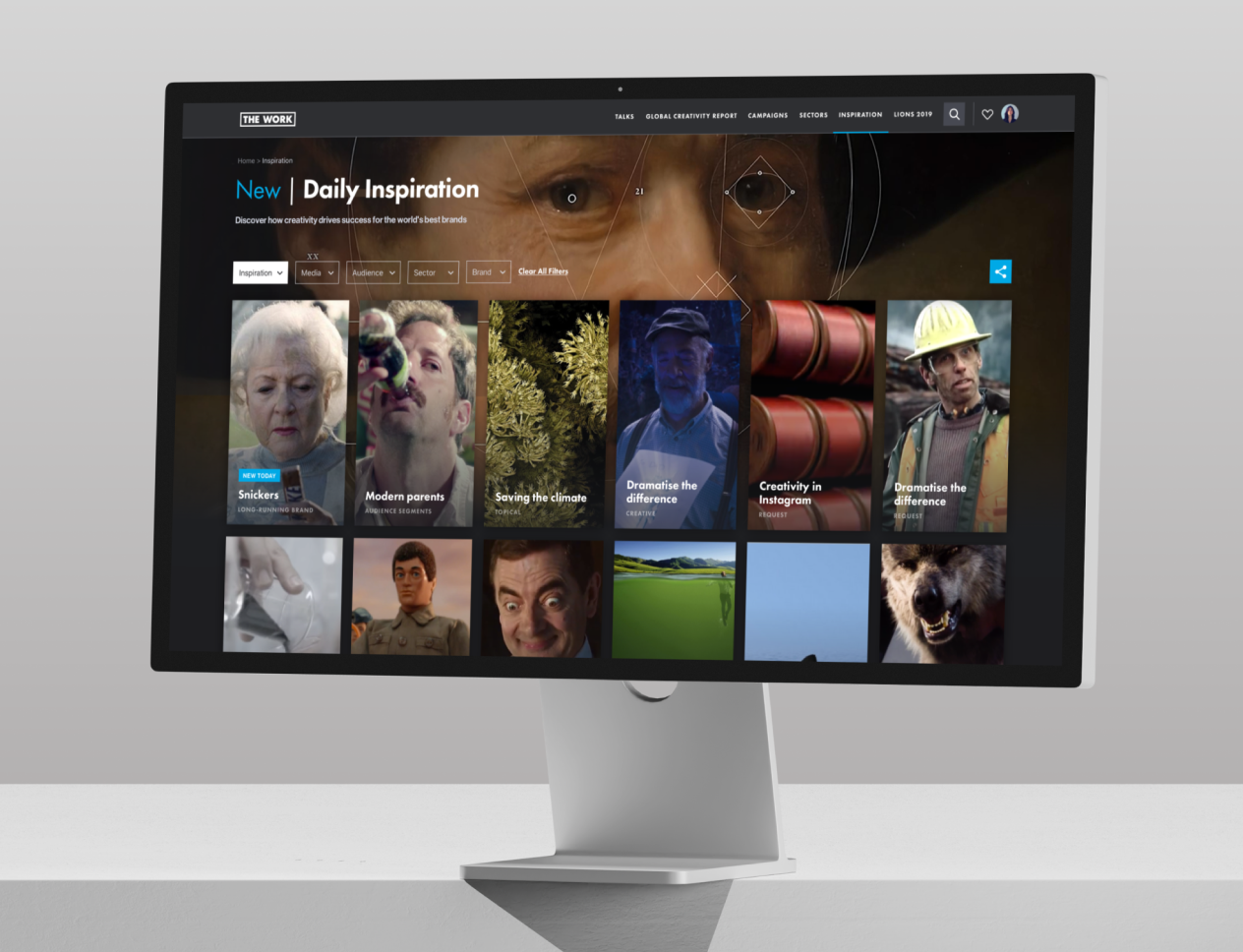
WEB3, web design, branding, illustration
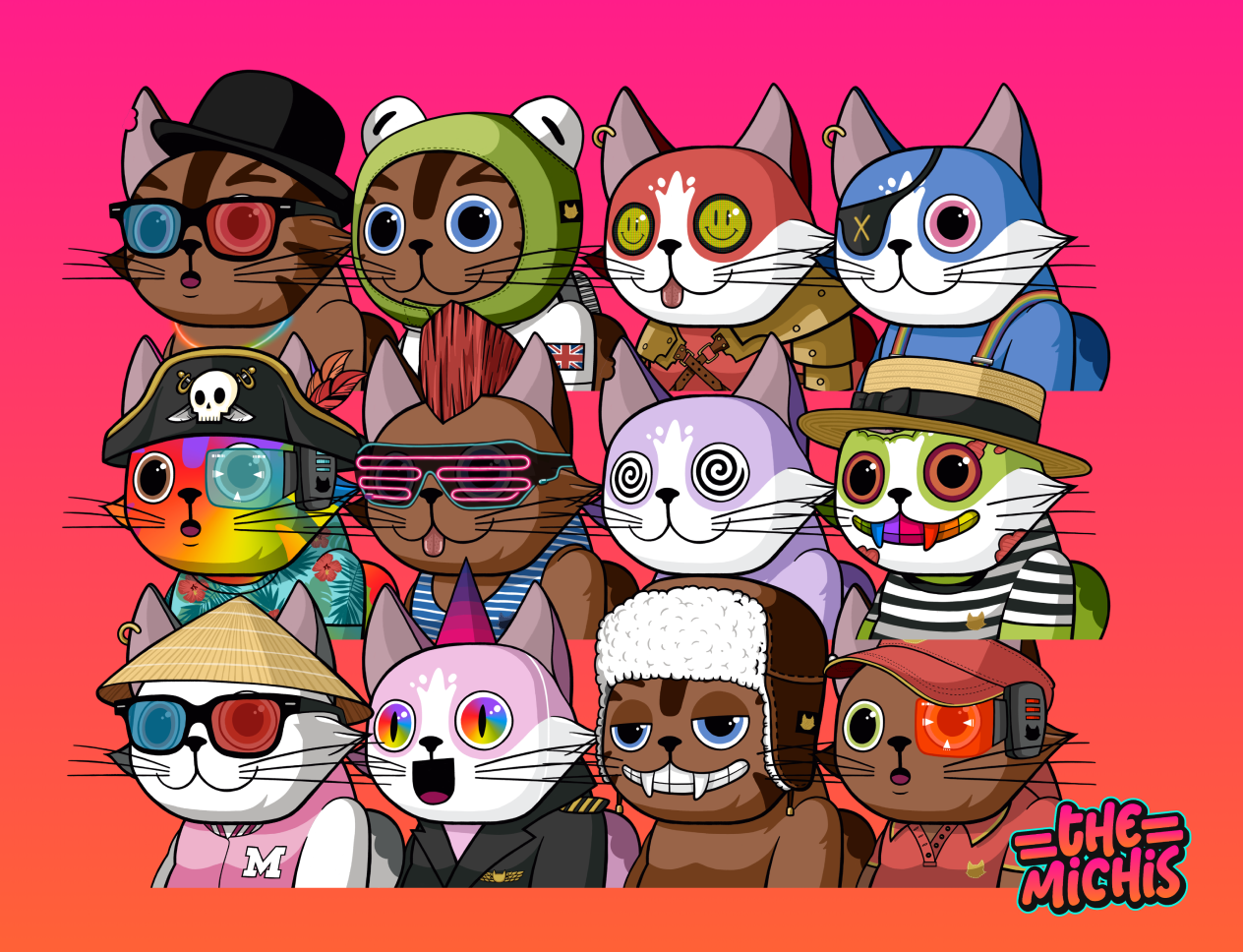
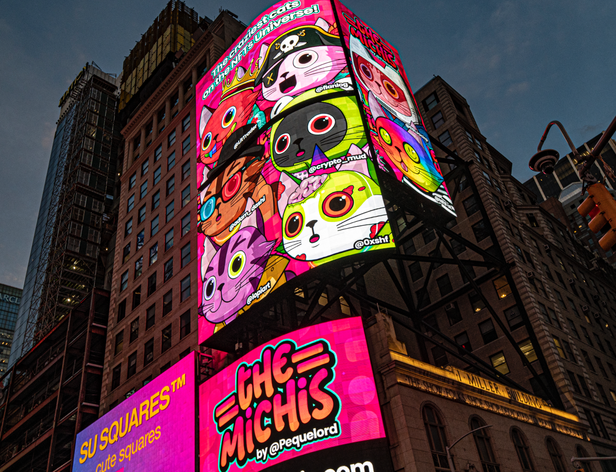
WEB3, web design, branding, illustration
SELECTED CLIENTS


Hiran Pattani
CTO, Ascential

It was a pleasure having Ramon on my team, one of the most talented and skilled people I've worked with. He delivered outstanding work in high-pressure situations, always staying calm and collected.

Sean Nolan
CEO, Blink


Ramon is awesome! Fantastic at both UI and UX. He was instrumental in moving our product and company forward - always positive, thoughtful and willing to help. He has great empathy for the user. A top egg!!!

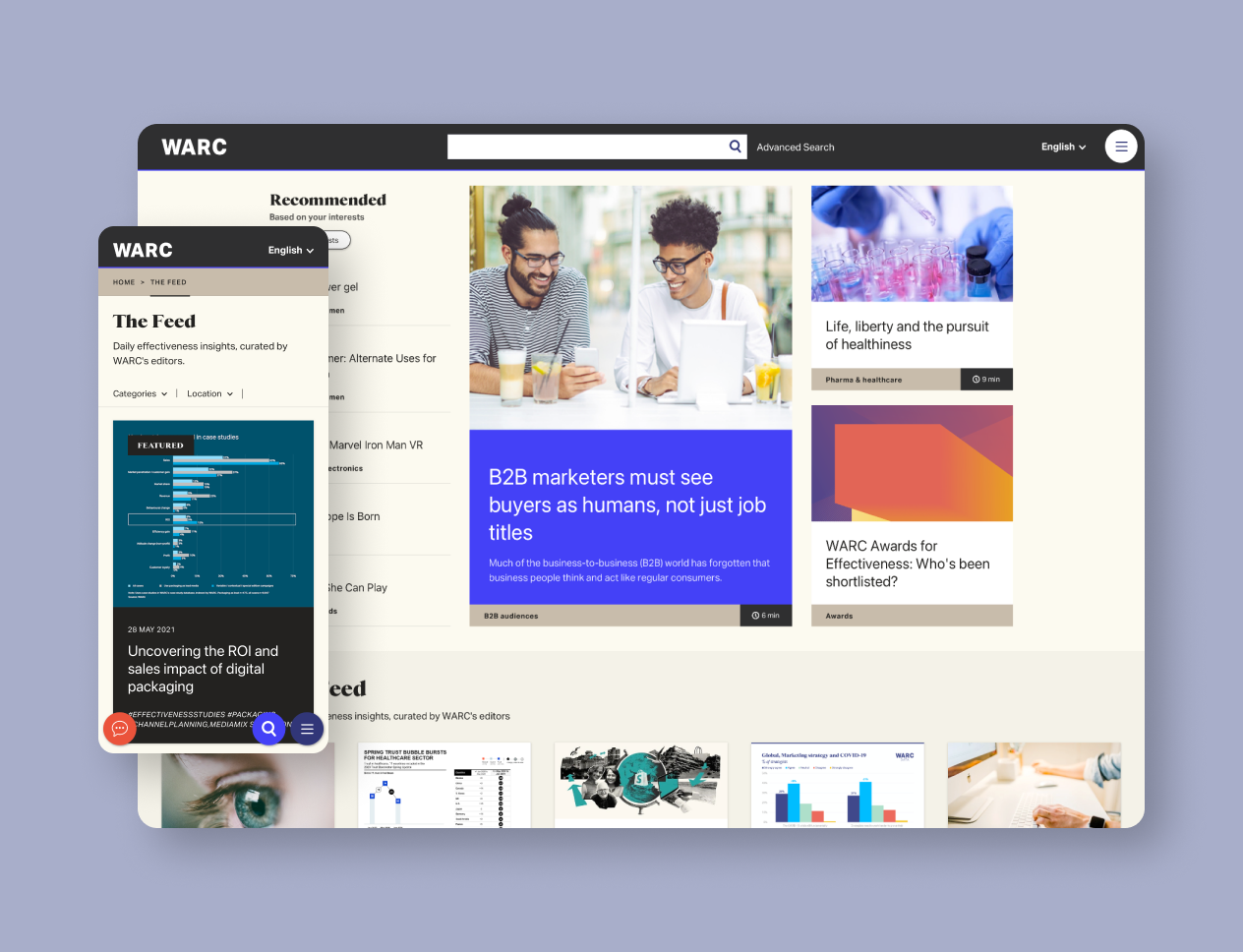
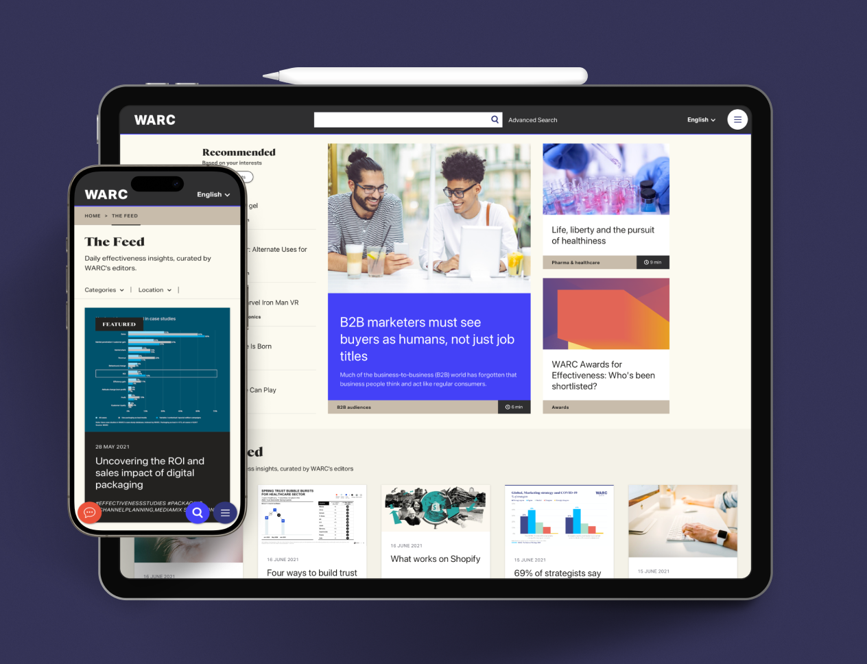
Paul Coxhill
CEO, WARC
Ramon made a big difference to our business. His solutions were always based on research, insight and best practice and his eye for design really elevated our offering.

Lisa Campana
Head of Design, Vira Health


Ramon is an absolute joy to work with. No matter the job, big or small, he is always up to the task and has a can-do attitude. He will happily go the extra mile to achieve the quality he wants. His sketchbooks are to be seen!

Lily Fletcher
Managing Director, MORNING


Ramon is a creative force, talented, innovative, and able to turn complex briefs into something beautiful and functional. His passion for technology and creativity is unmatched. I would work with him again without hesitation.
Hiran Pattani
CTO, Ascential
It was a pleasure having Ramon on my team, one of the most talented and skilled people I've worked with. He delivered outstanding work in high-pressure situations, always staying calm and collected.
Sean Nolan
CEO, Blink
Ramon is awesome! Fantastic at both UI and UX. He was instrumental in moving our product and company forward - always positive, thoughtful and willing to help. He has great empathy for the user. A top egg!!!
Paul Coxhill
CEO, WARC
Ramon made a big difference to our business. His solutions were always based on research, insight and best practice and his eye for design really elevated our offering.
Lisa Campana
Head of Design, Vira Health
Ramon is an absolute joy to work with. No matter the job, big or small, he is always up to the task and has a can-do attitude. He will happily go the extra mile to achieve the quality he wants. His sketchbooks are to be seen!
Lily Fletcher
Managing Director, MORNING
Ramon is a creative force, talented, innovative, and able to turn complex briefs into something beautiful and functional. His passion for technology and creativity is unmatched. I would work with him again without hesitation.